

If you have a limited SEO budget then help yourself to boost your website’s rankings by watching this short video. Small businesses can do plenty of basic on-site SEO checks and many of the changes themselves. Here are 10 points to check on your website and it will only take…
More than ever before, Google places more weight in their algorithm on mobile usability of a website as a ranking factor; but don’t panic and don’t rush in to a poorly thought out “solution”.
If you didn’t know already Google have been recommending the use of responsive websites since 2012 (http://
What is a Mobile Responsive Website?
Responsive sites are built in such a way that they can determine the size and orientation of a screen and the type of device, then automatically display the website in the most appropriate way for that device so if it’s a phone any phone numbers displayed will be callable via a simple click. More relevantly only the most important parts of any page are immediately displayed and in a configuration that suits the screen size. This is not the same as a separate mobile website; there is only one version of the code in a responsive site and it can adapt to any size device, unlike specific mobile versions which are built for screens of a certain size. The content of each web page is still the same but may be displayed differently e.g. in a tab or accordion that you can click to expand the content and make it visible.
So the need for a responsive website should be on everyone’s radar already. Certainly it is a priority for the websites that we work with here at Ditto Digital if they are not responsive already when we embark on a digital marketing or SEO campaign. Included in that requirement to have good mobile usability in order to achieve good organic rankings in Google searches is how quickly a web page can be presented to a user on mobile and how quickly the user can interact with your website. (You can read more about this in our Core Web Vitals guide here).
4-Step Check to Discover Mobile Usability Problems
Here’s How To Check for Mobile Usability Issues on a Website:
- Check your website for problems
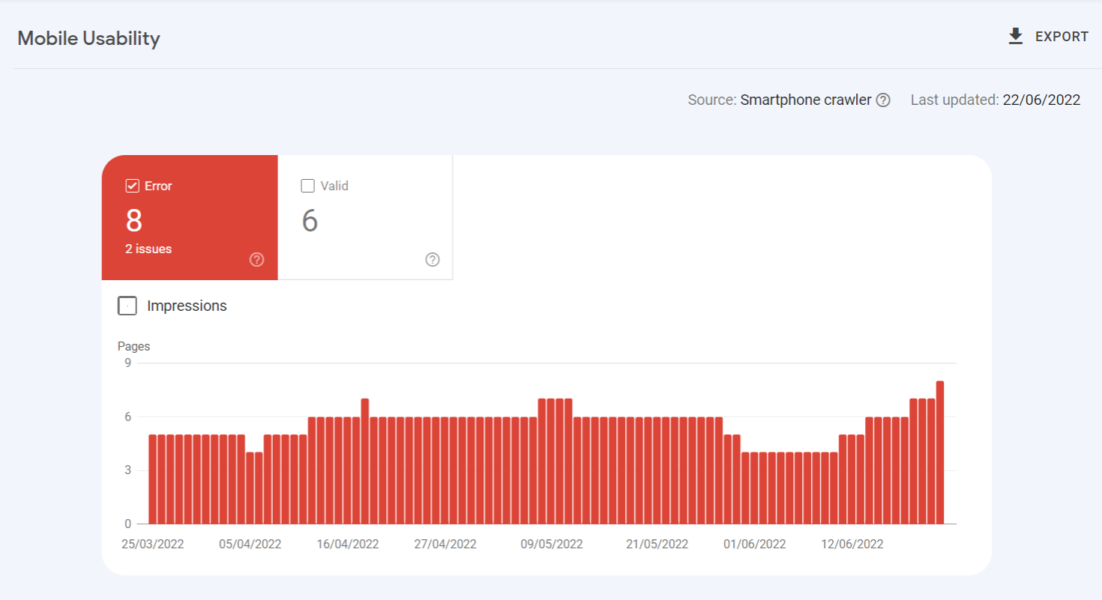
Check your website for any potential mobile usability problems by logging in to Google Search Console. Under the “Experience” menu on the left-hand side of the screen click “Mobile Usability”. If there are any errors shown, click on the error line e.g. “Clickable elements too close together” and this will provide a list of example pages that are not mobile friendly.
- Check the percentage of visitors who use mobile devices
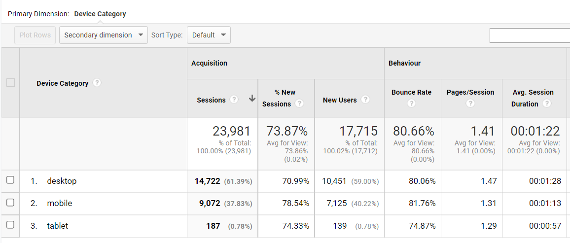
Check the current percentage of your visitors who access your website via mobile devices in Google Analytics. Login to your Google Analytics account (ask your web developer to give you access if you don’t already have it) and on the the menu on the left-hand side of the screen click Audience ➤ Mobile ➤ Overview to find the distribution of visitors across different types of devices. Low percentages (<20%) might suggest few visitors searching via mobile but could also be an indication that your rankings are much lower from mobile devices because the website is not mobile-friendly – so also check your mobile rankings.
- Check you mobile rankings
Check you mobile rankings today and monitor them closely over the coming weeks to see if there is an improvement once the mobile usability errors have been resolved.
- Make a plan
If you haven’t already, make a plan to convert your site to a responsive design, but take the time to get it right and have it well designed rather than rushing it with a knee jerk reaction. Even if your website is mobile responsive it may still have some mobile usability errors that need fixing and also performance issues on mobile devices.
Searches performed from a mobile device will rank those sites that provide a better mobile experience higher, but remember this is only one of 200+ ranking factors so it is not the only factor affecting your position in the rankings. Nevertheless, it is an important factor to check.
Don’t assume you know what mobile visitors will want to do on your site – whilst mobile visitors might once have just browsed and researched while out and about, easy access to good internet connections in hotspots and free wifi networks, not to mention surfing from the sofa, means visitors are making buying decisions, and buying, from mobile devices in increasing numbers.
Whatever type of business you have and whatever type of website, whether it is just a shop window or a fully fledged e-commerce site, mobile searches are an essential part of your digital marketing strategy. Even if you receive few visits via mobile devices now you cannot assume potential customers will not want a mobile friendly site, and soon.
You Might Also Be Interested In…


Source link
Related posts:
Mất bao lâu để phục hồi hình phạt thuật toán - Google trả lời
Top Careers in Marketing (Highest Paying Digital Marketing Skills In 2022)
15 Essential SEO Terms You Should Know | Koozai
Is Consolidated Media Buy a winning strategy? Let’s find out.
Geofencing Marketing 101
Top 10 Facebook Advertising Mistakes Pest Control Companies Make
Soft Entrepreneurship Skills To Outgrow Your Competitors – SEO Digital
Shein sees valuation drop by one third: report · TechNode
Upcoming Webinar: Careers in Engineering
New Oriental's Koolearn sees 590% increase in revenue · TechNode
The Awards Magazine Names Brian Solis as a Top 100 Global Thought Leader on Technology to Follow in ...
All about Digital Marketing | Simply Explained